Schools normally receive feedback within a day or so of the survey closure in a summary presentation called Key Insights. It details the school’s range of student experiences, rates and ranks the qualities of the community, and contrasts experiences across all demographic subcategories, highlighting the more challenged subgroups. Further, the Key Insights presentation addresses the faculty feedback, contrasting both the faculty & staff perceptions of the school’s qualities and the faculty & staff's mix of identities with the students. These 15 slides provide sufficient detail to frame and discuss the overall school climate, its challenges and opportunities, and to hold constructive dialogue around priorities for intervention/prevention strategies.
Feedback and Tools: key Insights

The Key Insights template consists of 14 PowerPoint slides that portray the school’s survey high-level results, make relevant comparisons and summarize the output from the analytical tools used in the data conversion.
Summary Overview

Dashboard offers comparisons to prior year or overall Inclusivity Index results for:
Overall Scores
Five lowest scoring qualities
Ten groups with most negative experiences

Summary of demographic counts (14 categories and 65 subcategories in 7-12 survey) color coded by overall scores exhibits how students identify across a broad range of demographics.

This analysis uses a statistical regression process to quantify the support and risk factors associated with negative or low scoring tendencies. These are statistically determined beginning with 13 demographic categories which are modeled and revised based on statistical significance. Demographic categories that do not meet this significance threshold are eliminated from the revised model. The result is presented in three sets: a base comprised of the most prominent identities, identities that reduce the risk of scoring negatively, and identities that increase the risk of negative scores.

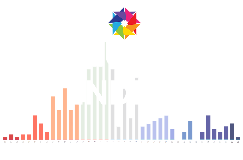
Range of Experiences and Qualities
The histogram lays out the number of students scoring at each level from roughly +40 to -40 and color codes then in 10 point ranges with the lowest scores in red and the highest in blue. Summary block shows the number and percentage of students scoring in the negative range and students with high scores over 20.

Displays all quality scores and color codes them by category: Climate for Diversity, Educational Process, Personal Experience and Critical Voice. Qualities are sorted by score with most challenging at the bottom. Average scores across the four quality categories are shown with vertical lines.

Using the quality measures, compares faculty representations of the student experience and views with the actual student quality scores. Color coding identifies where faculty overestimates (blue) and underestimates (red) the students views and where they are aligned (gold).
Groups with Negative Experiences and Their Qualities

Shows all demographic subcategories in one display with cell size proportional to the number of students choosing that identity. Color coding denotes that group’s tendency to rate the school and their experience in a negative or relatively low range.
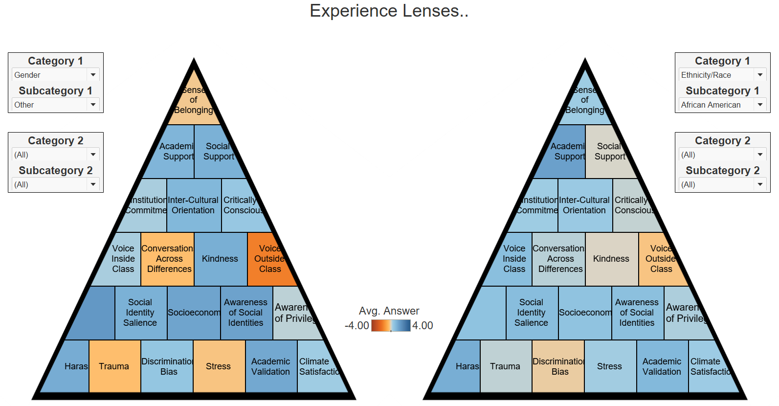
Experience lenses use color coding to show the average score for a single demographic subcategory. The Key Insights module includes 10 of these lenses, one for each of the groups identifying on the Dashboard as having the greatest tendency to report a negative experience.
Demographic Comparisons Student versus Faculty

Comparison of the student mix of identities to the faulty for six demographic categories: Religion, Ethnicity/Race, Socioeconomic, Gender, Sexual Orientation and Social.